Open the workspace · Read the practical guide
Draw a system you can keep editing
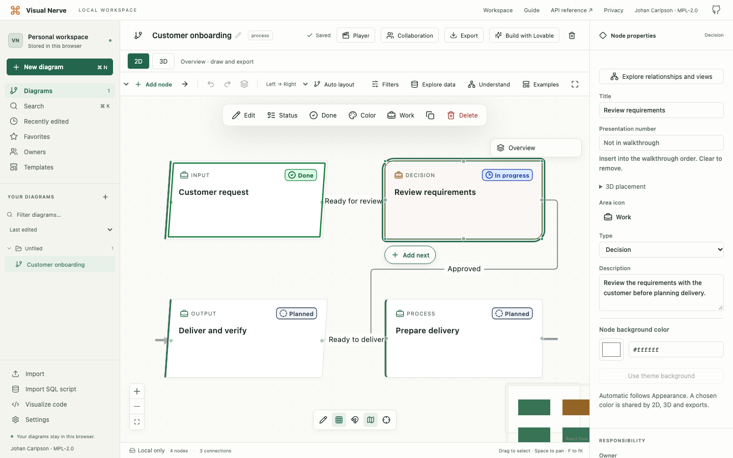
Start with a mind map, flowchart, timeline, customer journey, process map, responsibility flow or system architecture. Objects and connections remain editable: name the steps, explain the relationships, choose icons and colors, and assign owners and statuses.
Use groups, collapsed branches, search and filters to keep a large diagram readable. Add a drawing layer for annotations without changing the graph. On a phone, Projects, Edit and Diagram actions open temporary panels around the canvas.
Choose a vocabulary for the system
Use HIPO for functional hierarchy and input/process/output documentation, or a classic DFD in Yourdon–DeMarco or Gane–Sarson notation to trace information through processes and stores. UML offers editable starting examples for all 14 diagram families, including class compartments, component ports, lifelines, timing and runtime deployment. BPMN offers process, collaboration, conversation and choreography examples with activities, event markers and participant relationships.
Notation properties and relationship ends stay part of the editable native diagram. These collections support graphical modeling and selected structural checks; they do not execute UML or BPMN or provide UML XMI or BPMN XML interchange. The separate Process Simulator supplies executable capacity and queue experiments.
Choose a notation collection · HIPO · Classic DFD · UML · BPMN
Turn rows into a useful visual question
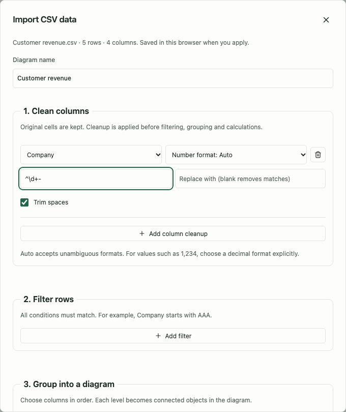
Import a CSV, clean columns, filter rows, choose grouping levels and calculate counts, sums, averages, medians or other measures. A large source can become a small, connected view of customers, regions or products.
Original cells remain available. Explain a measure using its contributing rows, investigate data quality, connect files through explicit matching keys and review a source refresh before applying it. Named analysis views let you return to another perspective over shared source data.
Displaying fewer groups does not reduce the rows used in a measure. The current limits include 200,000 rows per source and 600 generated objects per view; structural and file-size limits still apply.
Explore CSV data · Connect and refresh sources
Measure history and investigate signals
Time Series & Signal Analysis follows Import → Explore → Measure → Detect → Validate → Simulate. Map local CSV, XLSX or JSON data, preserve gaps and units, and explore line, area, bar, valid OHLC and reconciled waterfall views.
Measure changes and intervals, fit a regression, compare periods or calculate correlation. Configure signal rules with visible thresholds and causal baselines, inspect their evidence, and replay them against chronological history in Signal Lab. Explicit outcomes are required for predictive accuracy metrics.
Compare reviewed Growth & Churn assumptions over the same future horizon. Observed history stays separate from scenario projections; a scenario range is not a statistical confidence interval. The packaged example uses five years of illustrative, reconciled customer and MRC data.
Explore the template · Follow the analysis guide
Read SQL and source code as connected structure
SQL SELECT and WITH queries reveal source aliases, joins, output expressions and column lineage. Table definitions reveal columns, keys and foreign-key relationships. SQL is analyzed locally and never executed.
Code import covers 50 programming/query/configuration languages plus linked Markdown documents with bounded structural analyzers. Import a ZIP project locally, review excluded files and choose a file, folder or declaration view. Start with a file overview or separate declarations, then inspect dependency evidence and confidence. Recognized calls can be heuristic or unresolved; the diagram is a reading aid, not a compiler or runtime debugger.
Existing .drawio and .vsdx files can also become editable native diagrams. Preview pages and import notes before choosing the page to create. Advanced shapes and routing may be simplified.
You can also export a whole diagram or selected nodes as an editable .drawio drawing. Text, basic shapes, groups and attached connectors use the saved 2D layout. Keep native JSON for the complete model; the export guide
explains conversion limits and how to continue editing the drawing.
Visualize SQL · Visualize code · Import diagram files
Keep a readable overview while exploring depth
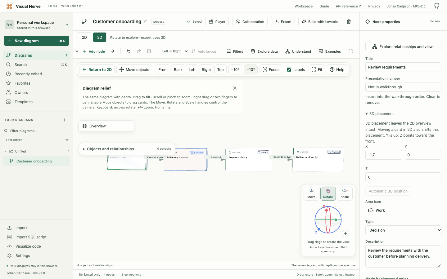
Switch the same styled objects and connections between 2D and 3D. In 3D, cards have relief and readable front and back faces. Rotate the view, focus a region and move selected objects while retaining a useful 2D arrangement.
Semantic overview can summarize a larger graph without replacing its original objects. Relationship questions show modeled paths with source evidence. Named snapshots let you review changes before restoring earlier diagram content.
Explore 3D · Understand a large graph
Explore the workspace on your phone
On a smaller screen, Projects opens the diagram list, Edit opens the selected object’s properties, and Diagram actions brings the advanced tools into reach. These temporary panels leave more room for the canvas when you close them.
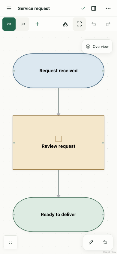
Use a desktop for large imports, detailed model configuration and broad comparisons. Work stays in the browser profile and website origin where you created it; opening a phone does not automatically synchronize a laptop’s workspace. Export and restore a copy when moving between devices.
Follow the mobile navigation guide
Explain the diagram as a walkthrough
Number objects or author storyboard scenes with their own narration, duration and saved view. Play the sequence with optional subtitles and local English or Swedish narration. Alan, a British male voice, is the English default.
Minimize the player to keep the canvas visible. Preload prepares upcoming audio. Export the sequence as a 720p, 30 fps video, with MP4 preferred and WebM used where supported. Voice assets need an initial download; narration is then generated locally. Export limits and codec support are explicit.
Test assumptions about work and capacity
Process Simulator is a separate template for arrivals, queues, processing, shared resources, routing, scaling and economics. Particles represent actual simulated work. Compare scenarios to see how a capacity change affects waiting, throughput, lost work, revenue and cost across the system.
The UI, local API and MCP use the same seeded simulation engine. An animated run and a MAX run with the same inputs produce the same business result.
Four dedicated capacity templates extend that engine: API & Compute Capacity for CPU, retained or stage RAM and database connections; Network & Multi-Site Capacity for shared payload transfers; Energy & Power Capacity for generation, grid and battery delivery; and Datacenter Capacity for a connected example with concurrent compute and an explicit energy budget. They use editable synthetic assumptions and observed metrics, with model version 2 separating their semantics from legacy models. Choose a model on the homepage or learn the units, controls and limits . These are allocation, fluid-transfer and energy-balance models, not hardware benchmarks, TCP or AC electrical solvers.
Organize larger models into main processes and nested subprocesses. Open a congested group to find the actual constrained step, with separate step assumptions and shared resources across process boundaries. Guided setup and the delivery-and-returns example provide editable starting points.
Keep and share the right kind of copy
PNG, PDF and SVG share the 2D visual view. SVG preserves vector text and geometry for scaling or editing in another application. Markdown shares a semantic outline. Native JSON preserves a diagram, and a complete workspace backup includes the wider local data needed for recovery.
Build with Lovable prepares a reviewed app specification and prompt locally. Opening its dialog sends nothing; choosing Open in Lovable explicitly shares the reviewed text. Review descriptions, SQL literals and other included detail before that handoff.
The workspace belongs to one browser profile and origin. There is no automatic workspace-wide cloud synchronization. Optional realtime collaboration lets approved people edit one deliberately shared diagram when a relay is configured. Document work adds per-diagram profiles, comments, node tasks and an informational activity feed; it also works locally without a room. Use exports and backups for portable copies and recovery.
Open Visual Nerve · Compare export formats · Understand local data