A LOCAL-FIRST VISUAL WORKSPACE
Understand
what connects.
Turn a process, a dataset or a codebase into a diagram you can explore. Follow relationships. Test assumptions. Explain what you see.
Free to use. No account. No mandatory backend. Saved in your browser.
Available in eight app languages. Choose your language in Settings.








SEE THE SYSTEM, THEN CHANGE IT
One extra business flow.
A different business.
A kiosk adds package pickup. What happens to the customers already waiting? Explore the example to see how shared capacity changes the answer.
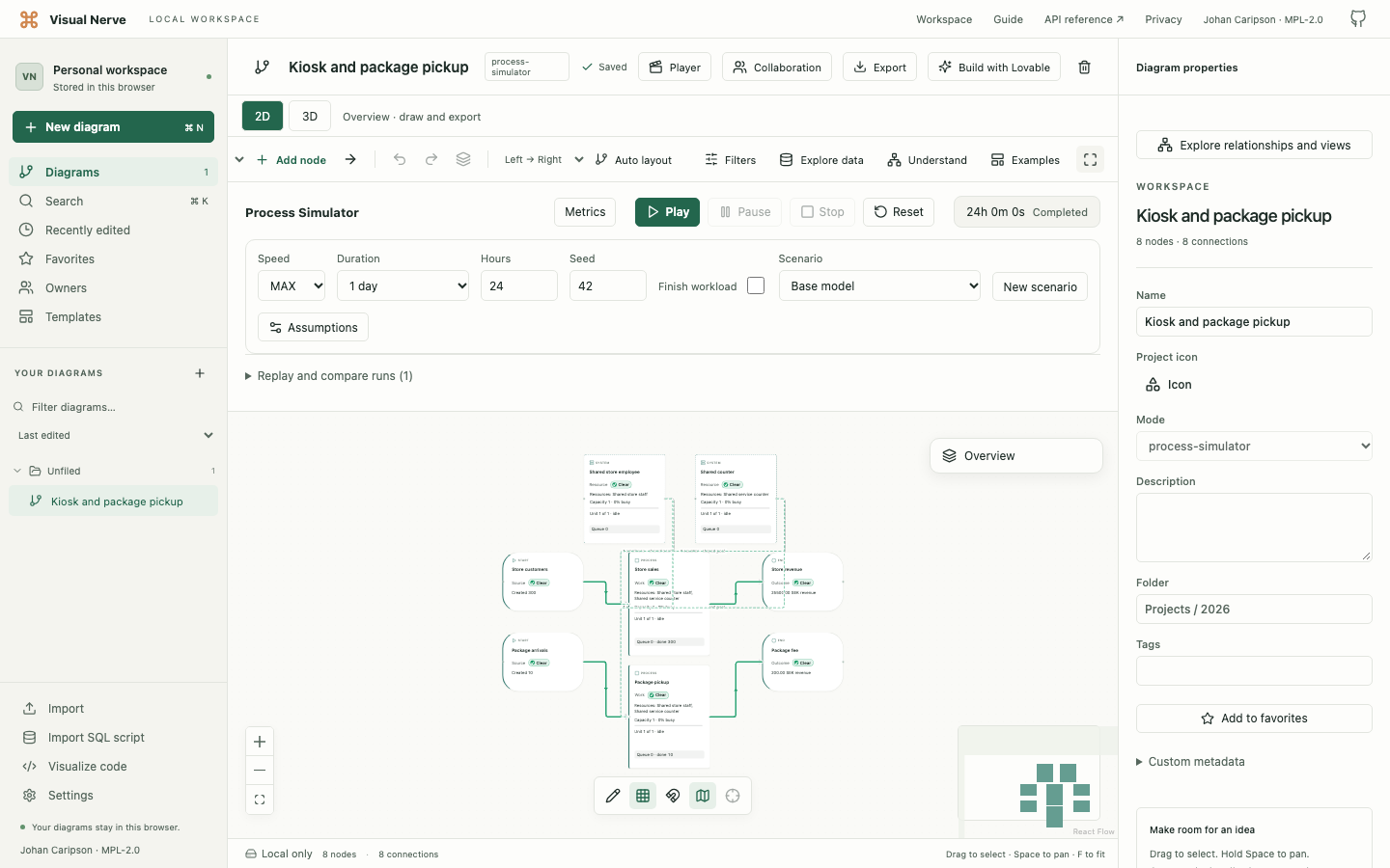
A kiosk and a package counter
Start with 300 store customers and 10 package pickups per day. Increase packages to 1,000. Watch both flows compete for staff, then test dedicated capacity.
- See queues where they actually form
- Compare waiting time, lost work and cost
- Change assumptions without changing the baseline
Opening the example creates an editable local diagram after you accept browser storage.
FOUR INFRASTRUCTURE CAPACITY TEMPLATES
Where does
capacity run out?
Change demand and capacity. Run a baseline, then compare what happens when work competes for the same shared resources.





-
API & Compute Capacity
Allocate CPU cores, case or stage RAM and database connection slots. See how request demand competes for shared capacity.
Open this template : API & Compute Capacity -
Network & Multi-Site Capacity
Set link bandwidth, payload sizes and fixed propagation delays. Follow transfers from separate sites through a shared link.
Open this template : Network & Multi-Site Capacity -
Energy & Power Capacity
Change generation windows, grid import limits and battery capacity. Track delivered energy, shortfalls and state of charge.
Open this template : Energy & Power Capacity -
Datacenter Capacity
Combine WAN, CPU, RAM, database connections and an explicit energy budget per request. Compare changes across one connected workflow.
Open this template : Datacenter Capacity
Each template creates an editable local example after storage consent and workspace unlock. Compare assumptions visually, or automate the same analysis through the local API and MCP.
Explore the models and their limitsMORE THAN A PICTURE
A workspace for
different kinds of understanding.
Map how work connects
Build diagrams and mind maps, mark responsibility and status, then walk through them in 2D or 3D.
Diagrams & presentations →Make unfamiliar data readable
Group a CSV, trace a SQL query or inspect code structure. Keep source evidence beside the relationships.
Data & code →Explore what happens next
Model shared resources, queues and economics. Run scenarios to see what a capacity change affects elsewhere.
Process Simulator →Work with your AI agent
Give an agent explicit access through an optional local bridge. Inspect and edit the same model you see.
MCP & API →REALTIME DIAGRAM COLLABORATION
A shared diagram.
Approved people.
Work together from computers, tablets and phones. See who is connected and which nodes they are exploring, while each person keeps a separate local workspace.

-
Invite, review, then work together
The owner approves each device as an Editor or Viewer. Editors can change the diagram; Viewers can explore it. An invitation alone does not grant access.
-
Encrypted between approved devices
Shared messages use MLS (RFC 9420) encryption. The relay forwards encrypted messages; approved participants can read the content you choose to share.
-
Your local workspace stays yours
Saved records remain protected by AES-256-GCM in each browser. Cameras and personal settings stay local. Source metadata, owner profiles and raw datasets need explicit disclosure.
Where does an AI agent fit?
An agent uses an approved participant’s local API/MCP connection. Its edits need both that participant’s room role and an explicit local write grant. A Viewer stays read-only; the agent cannot invite or approve people.
Optional. Requires a configured collaboration relay. The integration has not been independently audited.
TIME SERIES & SIGNAL ANALYSIS
Turn data into signals
Measure change. Spot patterns. Explore what could happen next.
Import growth, churn, revenue, or other time-series data. Measure changes directly in your charts, define signal rules, review historical results, and compare what-if scenarios.
Work visually without AI, or connect your own tools through the local API and MCP bridge.
The template opens after local storage consent and workspace unlock. The example is illustrative; scenarios describe assumptions, not guaranteed forecasts.
YOUR WORKSPACE, YOUR BROWSER
Local by design.
Protected in your browser.
The separate app workspace protects saved content with AES-256-GCM and a password you control. Session locking and explicit agent permissions help keep access deliberate. No account or mandatory cloud database is required. Read the security model, including backup and device responsibilities.
START WITH SOMETHING YOU WANT TO UNDERSTAND
An idea. A process.
A file full of questions.
Open your workspace ↗Need a starting point? Follow the five-minute guide.